
The Tile Trends Set to Dominate Interiors in 2027
All images ©Hyperion Tiles
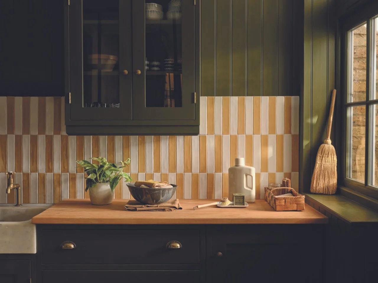
From warm-toned checkerboards and tactile surfaces to bold patterns and more considered layouts, Hyperion Tiles Director Richard Skeoch shares the tile trends set to shape the year ahead.
Tiles have moved far beyond their purely practical purpose, with homeowners and designers increasingly using them to bring colour, pattern, texture and character into their interiors. From statement bathroom walls to patterned kitchen floors, there is now more choice than ever when it comes to creating a scheme around tiles. Here, Richard shares the tile trends to know about in 2027.
Colour drenching is moving onto tiles
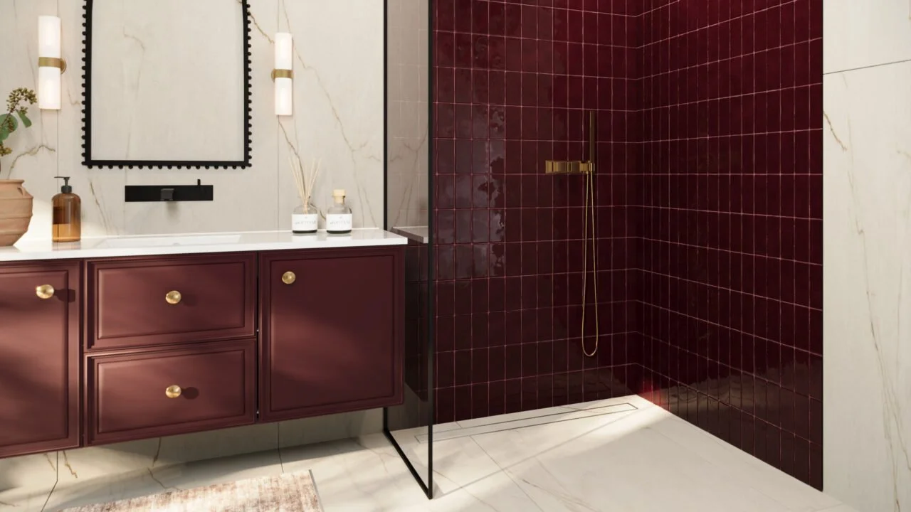
Rather than using contrasting colours across different surfaces, homeowners are increasingly embracing tonal schemes where tiles, paint, cabinetry and other elements work within the same colour family.
Richard says: “We are seeing more interest in creating a really cohesive colour story, rather than treating the tiles as a separate element within the room. Using different shades of the same colour across the walls, floor, cabinetry and other details can create a much more immersive feel, particularly in a bathroom.”
“This does not mean everything needs to be in exactly the same shade. Working with slightly different tones, finishes and textures within the same colour family can add depth while still creating that feeling of a space being enveloped in colour and is a great way to make tiles feel like part of the overall scheme.”
Tiles are moving beyond the bathroom and kitchen
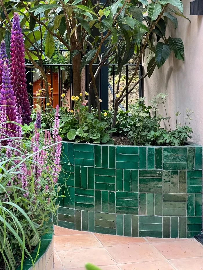
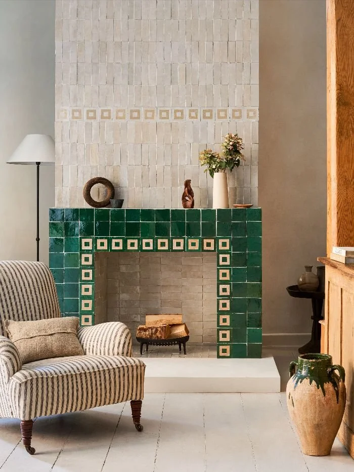
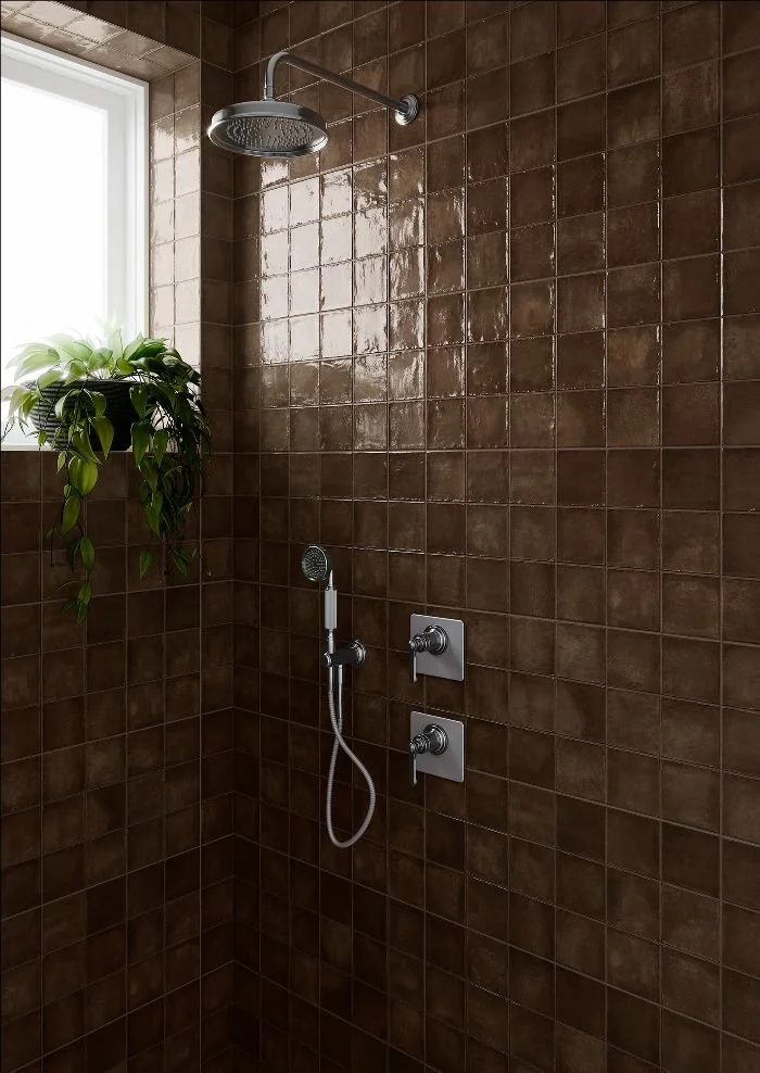
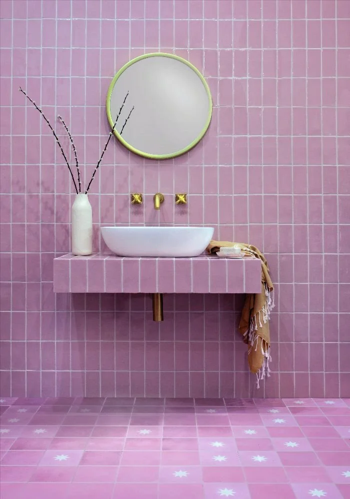
Tiles are increasingly being used throughout the home, with homeowners looking beyond traditional wet areas and considering how tiled surfaces can add character to other spaces.
Richard comments: “We are seeing tiles being used much more creatively throughout the home, from hallways and bedrooms to boot rooms, fireplaces and even living spaces. The question is becoming less about where you need a hard wearing surface and more about where a tiled surface could add something to the room.”
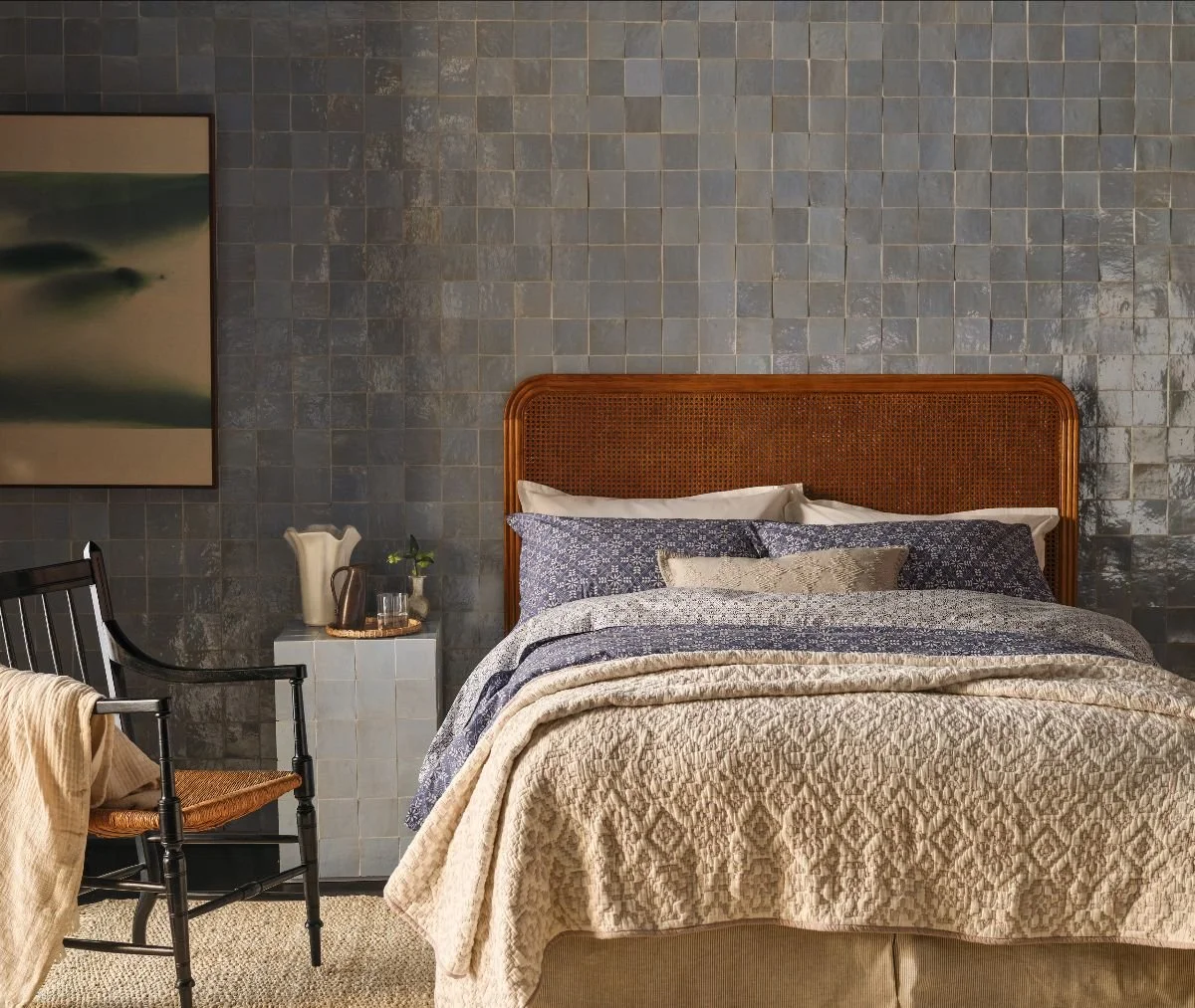
“Using tiles in these less expected areas can be a great way to introduce colour, texture or pattern without having to commit to using it throughout the whole room. A tiled fireplace or feature wall, for example, can become a real design statment.”
Warm, tonal checkerboard is replacing stark monochrome
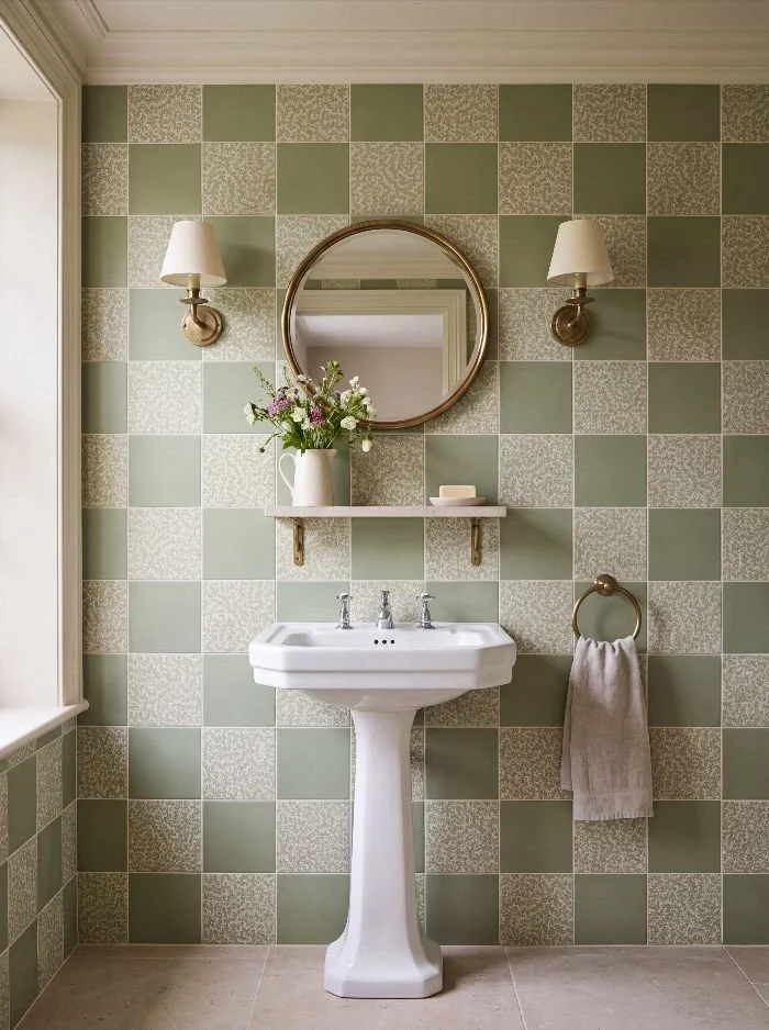
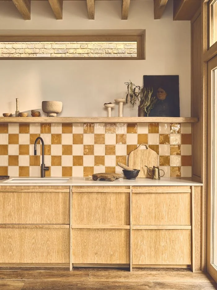
While checkerboard patterns are set to remain popular, Richard believes the look is becoming softer and more considered, with warmer combinations replacing the traditional black and white pairing.
Richard says: “Checkerboard has been around for generations, but the way we are using it is changing. We are seeing much more interest in warmer combinations such as cream, taupe, terracotta, pink and natural stone tones. This makes the pattern feel softer and easier to live with, while still giving a room plenty of character.”
Texture is becoming just as important as colour
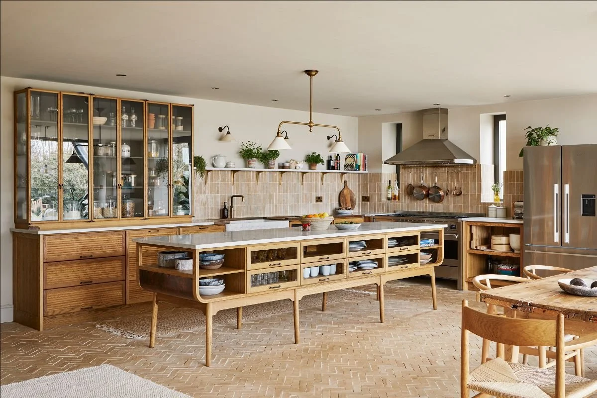
Smooth, uniform tiles are being joined by more tactile surfaces, from subtly textured porcelain to fluted and three dimensional designs.
Richard explains: “Texture is a great way of adding interest when you do not necessarily want to introduce a strong colour or pattern. A textured tile can catch the light differently throughout the day and create depth, which is particularly effective on walls. For a more relaxed scheme, I’d mix tactile tiles with natural materials such as timber, linen or stone. Bringing these different textures together creates a warm, relaxed feel without everything looking too coordinated.”
Pattern is becoming more confident
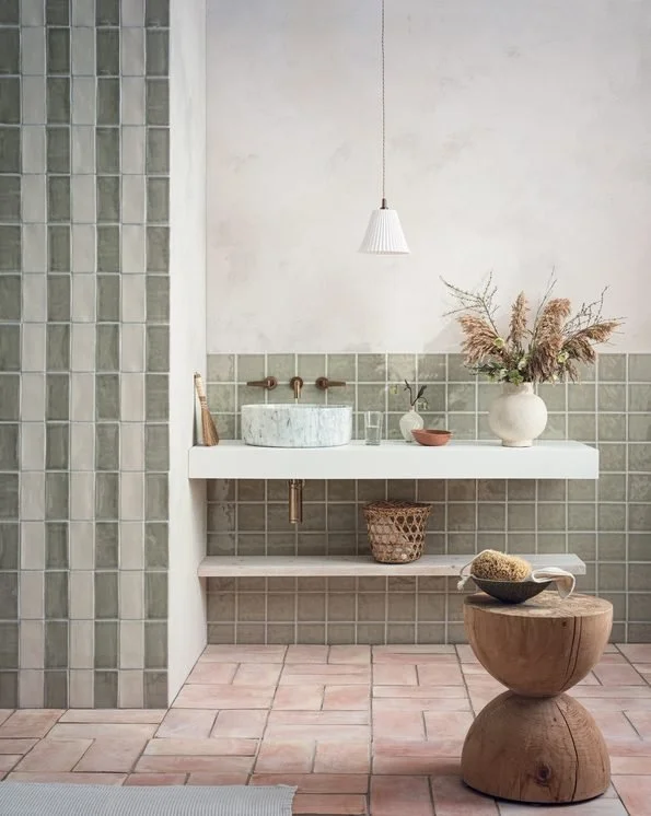
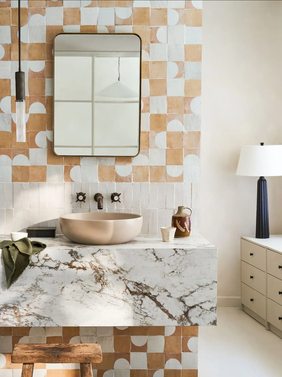
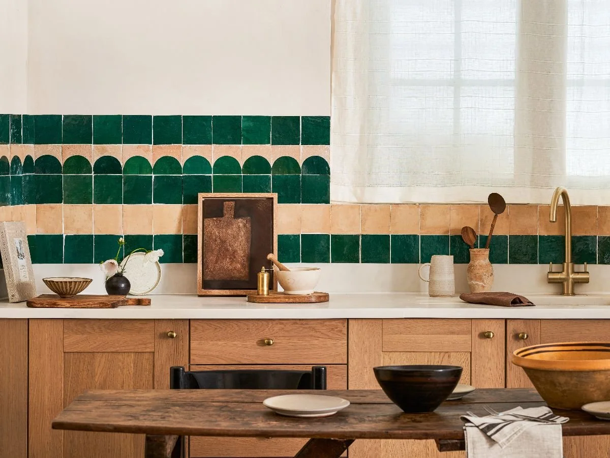
Rather than restricting patterned tiles to small splashbacks or bathrooms, homeowners are becoming more adventurous with where and how they use them.
Richard says: “We are seeing much more confidence when it comes to pattern. A patterned tile does not have to mean covering an entire room. It can be used to define a particular area, create a focal point or introduce interest to an otherwise simple scheme. Using pattern in smaller or more defined areas can be a great way to introduce personality and hallways, cloakrooms and utility rooms are particularly good places to experiment. Patterned tiles can also be a practical choice in busy areas as they help to disguise everyday marks and wear.”
Richard’s advice for getting tiles right
While trends can be a great source of inspiration, Richard believes it’s just as important to consider how a tile will perform and feel within the wider space:
“One of the biggest mistakes people make is choosing a tile simply because they love the way it looks, without thinking about how it will work in the room over time. It’s important to consider how much use the space will get, how the tile will work alongside the other materials and finishes in the room, and whether the size, format, finish and colour will create the overall feel you want. It’s worth considering the bigger picture rather than choosing a tile in isolation.”
Richard concludes, “A beautiful tile that isn’t suitable for the intended application can quickly become an expensive mistake, so I would always recommend checking the technical specification alongside the design. Factors such as durability, slip resistance and maintenance requirements can make all the difference to how well a tile performs in the long term. Taking the time to get these details right from the outset means you can create a scheme that looks beautiful today but is also practical, durable and built to last.”